ABC Assistance is a custom-designed brand identity and stationery solution created for ABC Ambulance to elevate visibility and establish a trustworthy visual presence in the emergency medical, air ambulance, and healthcare assistance sector. The corporate letterhead is designed to communicate medical precision, rapid response, and clinical reliability to healthcare partners, insurance providers, and patients.
For the project, we developed a professional corporate letterhead system that highlights emergency medical reliability, helping healthcare partners, hospitals, and patients instantly recognize the brand across formal medical documentation and administrative touchpoints.
What We Did
The brand collateral was designed to be a bold, recognizable asset in the emergency medical and assistance space, replacing generic stationery with a distinct, dynamic, and brand-aligned visual identity system.
Brand Concept
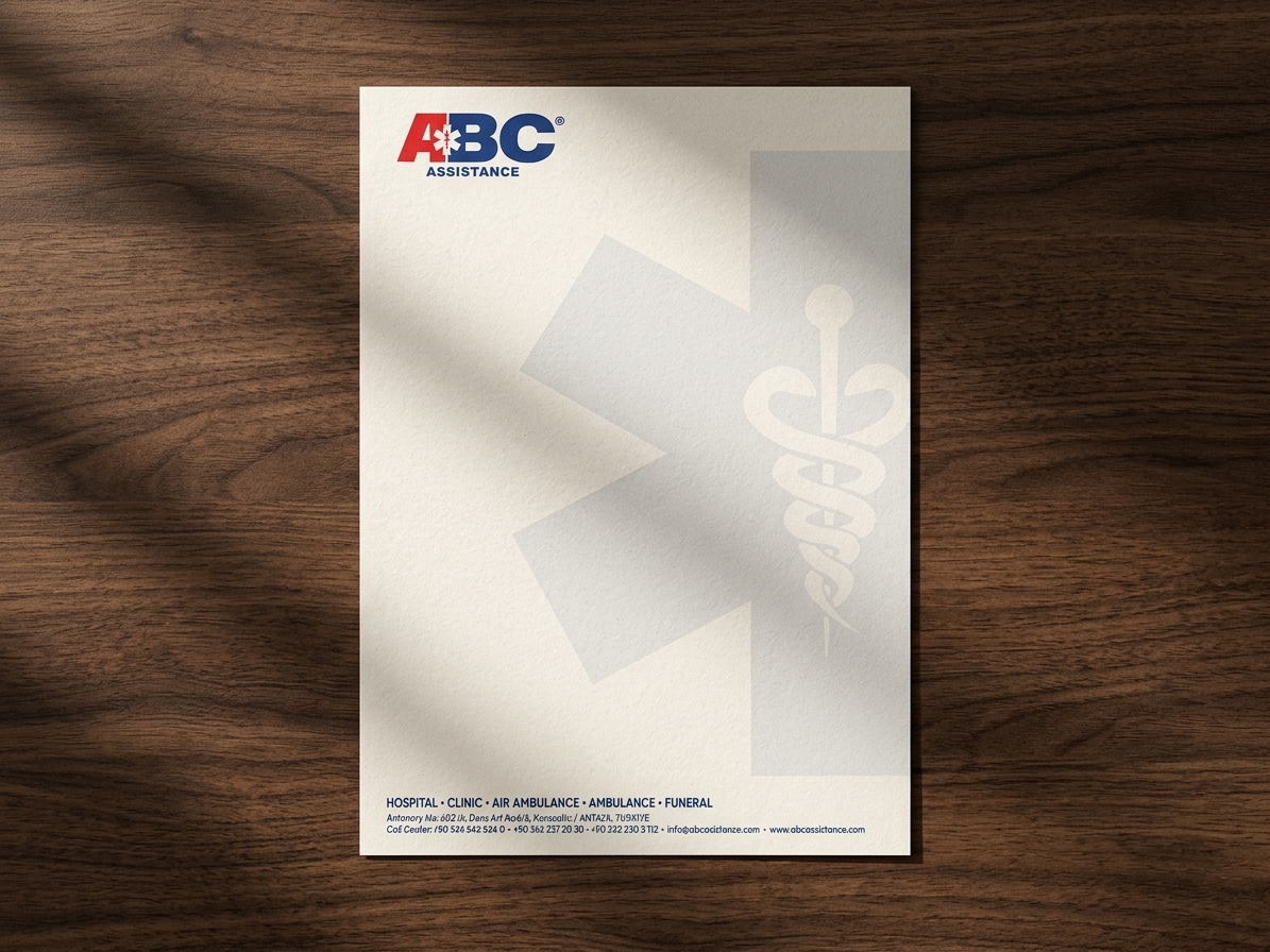
We developed the letterhead layout featuring the primary “ABC ASSISTANCE” logo positioned prominently in the top-left header, featuring a bold red ‘A’ embedded with a white Star of Life icon alongside deep blue lettering.
Typography
The design pairs the authoritative corporate logo with clean, structured sans-serif typography across the footer. The lower layout establishes a crisp information hierarchy listing core medical services, call center numbers and web credentials.
Brand Identity
Visual elements, medical iconography, and an emergency-focused color palette (vivid red, corporate blue, and soft neutral gray) were deeply integrated to reflect speed, safety, and medical authority. This tailored aesthetic helps the organization build trust and strong brand recall across international healthcare networks, hospital transfer manifests, and administrative communications.
Application Focus
The visual layout is specifically optimized for formal medical reports, patient transport manifests and official corporate correspondence, perfectly aligning with the brand’s positioning for comprehensive emergency services.
Scalability
A clean, high-contrast structural layout ensures that both the header logo and footer contact details remain sharply legible across all uses—from printed physical correspondence and faxed medical records to digital PDF forms and electronic healthcare documents.
Print Readiness
We developed this letterhead template strictly for high-end corporate stationery printing. By precisely calibrating the background watermark opacity and utilizing vector-based color separations, we ensured the sheet prints cleanly on premium paper stock while leaving the central area completely clear for typed or hand-written medical text.
The Result
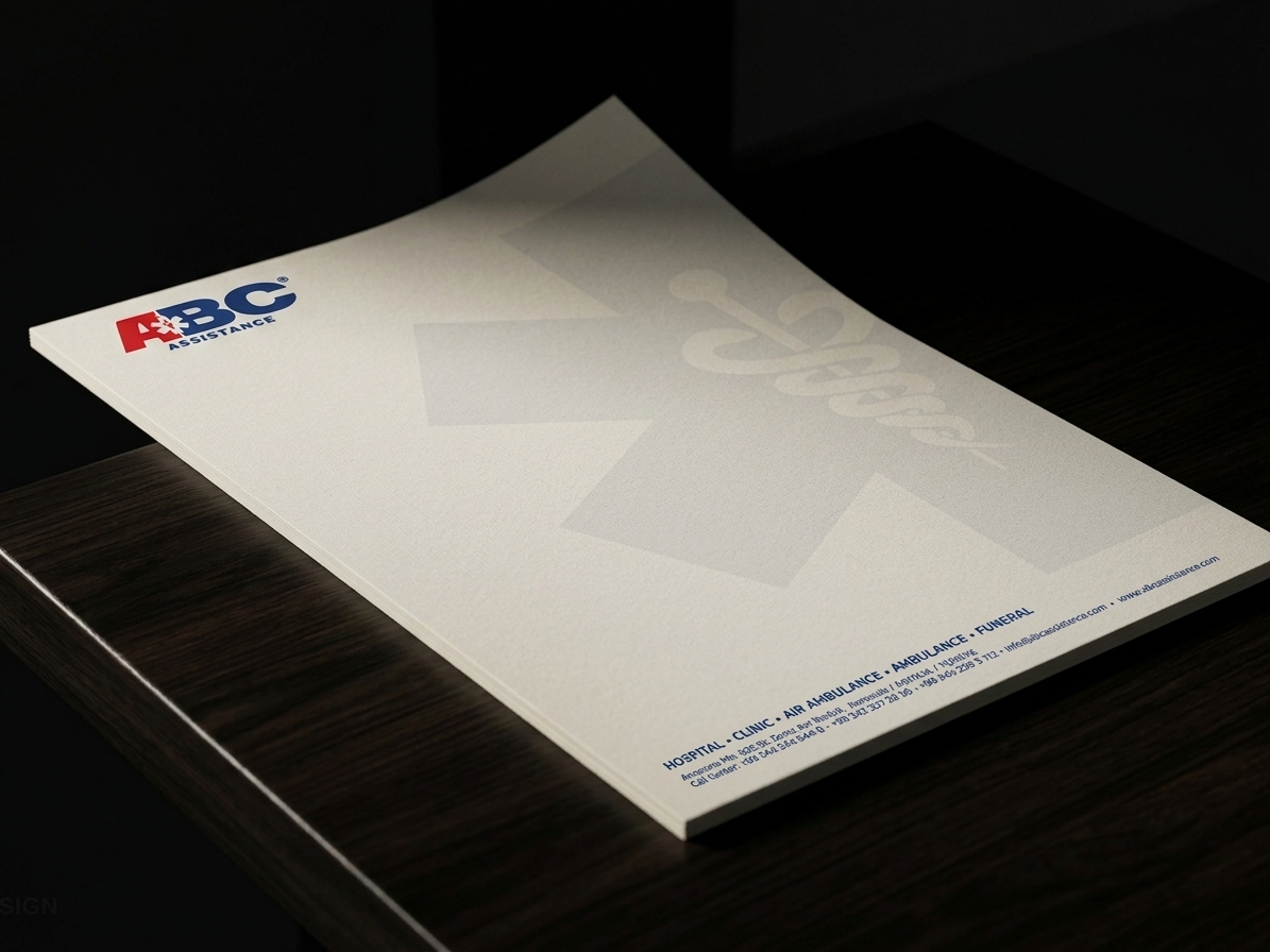
The final ABC Ambulance letterhead design transforms standard corporate stationery into a high-impact branding tool, combining recognized medical iconography with a crisp, functional document layout. This delivers a specialized identity solution that makes professional recognition effortless while ensuring official documents perform flawlessly across physical and digital channels.
Let’s Craft Stories That Leave a Lasting Impression
Looking for editorial layouts that turn pages into immersive brand experiences? We design bespoke magazines, lookbooks, and brand guidelines that captivate your audience, communicate your narrative with elegance, and elevate your overall brand perception.