AKANAY is a custom-designed brand identity and corporate stationery solution created for Akanay Yapı Group to elevate visibility and establish a modern, authoritative visual presence in the construction, real estate, and structural engineering sector. Tailored for versatile application, the letterhead and envelope set is engineered to communicate architectural strength, engineering precision, and corporate reliability directly to B2B partners, contractors, and real estate clients.
For the project, we developed a cohesive corporate stationery suite that highlights architectural strength and structural precision, helping real estate partners, contractors, and clients instantly recognize the brand across formal correspondence and business touchpoints.
What We Did
The brand stationery was designed to be a refined, recognizable asset in the construction and building sector, replacing generic corporate paper with a distinct, dynamic, and brand-aligned visual identity system.
Brand Concept
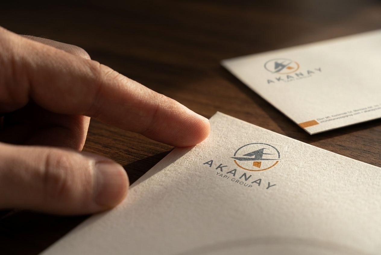
We developed the Akanay identity centered around a circular geometric emblem featuring a stylized structural ‘A’ interlocked with dynamic architectural facets. The visual composition conveys engineering stability, structural precision, and modern construction quality.
Typography
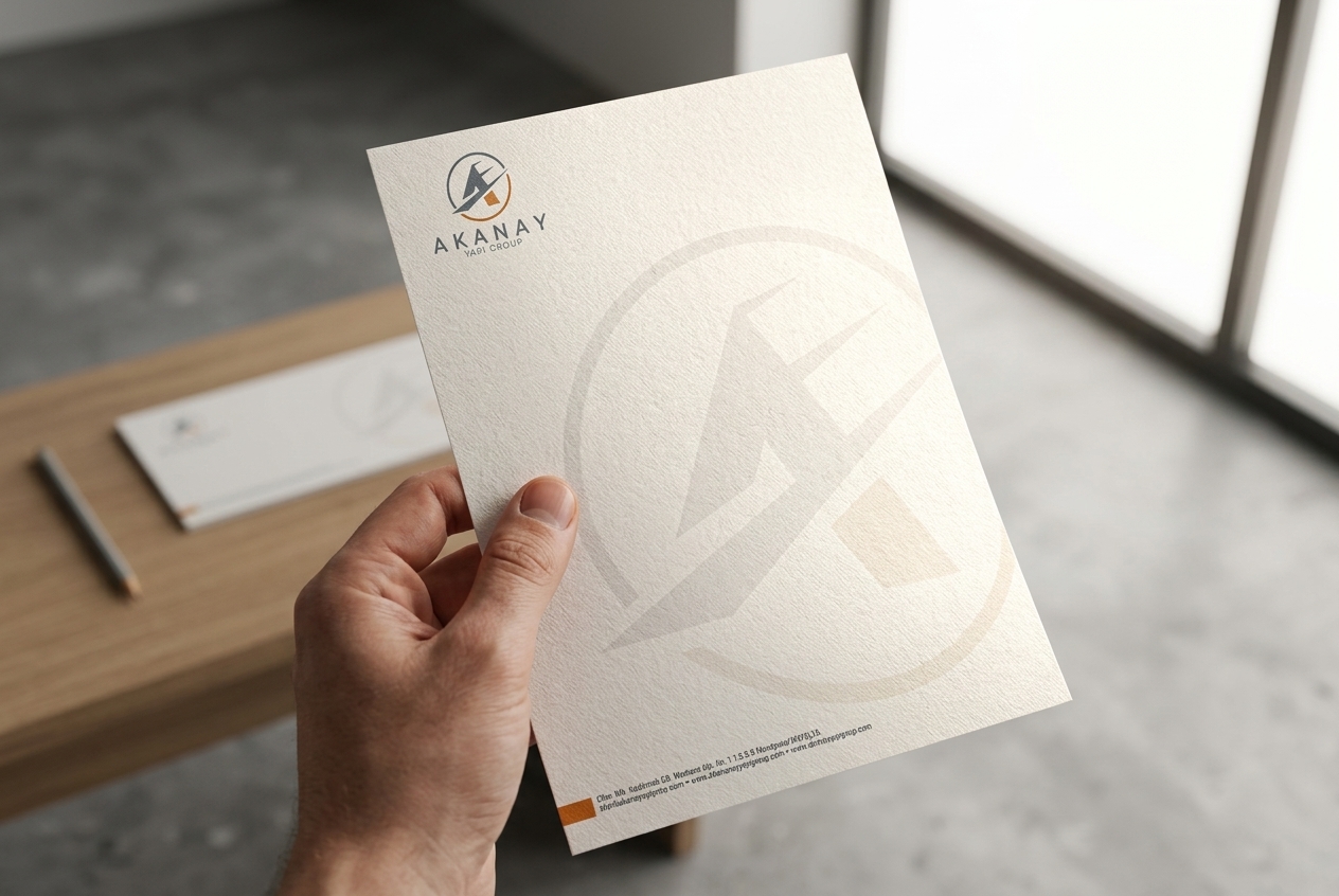
The design features a bold, widely spaced geometric sans-serif wordmark for “AKANAY”, anchored by the clean, secondary descriptor beneath it. The footer layout incorporates a crisp contact line set against a charcoal and vibrant accent block for readability.
Brand Identity
Visual elements, structural geometry, and an architectural color palette (warm construction orange, slate charcoal gray, and clean off-white) were deeply integrated to reflect durability and corporate stability. A large, faint watermark of the primary emblem spans the background of both the letterhead sheet and matching business envelope, adding an executive finish without obscuring typed document text.
Application Focus
The visual layout is specifically optimized for official construction bids, project proposals, B2B engineering contracts, architectural manifests, and executive correspondence, perfectly aligning with the brand’s positioning for high-end building development.
Scalability
A clean, high-contrast structural layout ensures that both the header logo and footer contact details remain sharply legible across all formats—from physical correspondence and printed project tenders to digital PDF forms and scanned technical documents.
Print Readiness
We developed this stationery suite strictly for high-end print reproduction. By carefully setting the central watermark’s opacity and maintaining clean vector geometry with sharp color separations, we ensured the design prints flawlessly on heavy offset paper stock and matching corporate envelopes without ink bleeding or obscuring body text.
The Result
The final Akanay Yapı Group stationery design transforms standard corporate paper into a high-impact branding tool, combining architectural iconography with a clean, functional document structure. This delivers a specialized identity solution that makes professional recognition effortless while ensuring official documents perform flawlessly across physical and digital channels.
Let’s Craft Stories That Leave a Lasting Impression
Looking for editorial layouts that turn pages into immersive brand experiences? We design bespoke magazines, lookbooks, and brand guidelines that captivate your audience, communicate your narrative with elegance, and elevate your overall brand perception.