KOTEAM B.V. is a custom-designed brand identity created for KOTEAM B.V. Personeelsdiensten to elevate visibility and establish an authoritative, trustworthy visual presence in the staffing, recruitment, and human resources sector. Tailored for versatile application, the logo is engineered to communicate professional placement, teamwork, quality assurance, and corporate reliability directly to B2B clients and job seekers.
For the project, we developed a trustworthy corporate identity that highlights professional staffing and team placement, helping B2B clients and job seekers instantly recognize the brand across corporate materials and portals.
What We Did
The brand mark was designed to be a bold, recognizable asset in the HR and employment services space, replacing generic recruitment icons with a distinct, dynamic, and brand-aligned visual identity.
Logo Concept
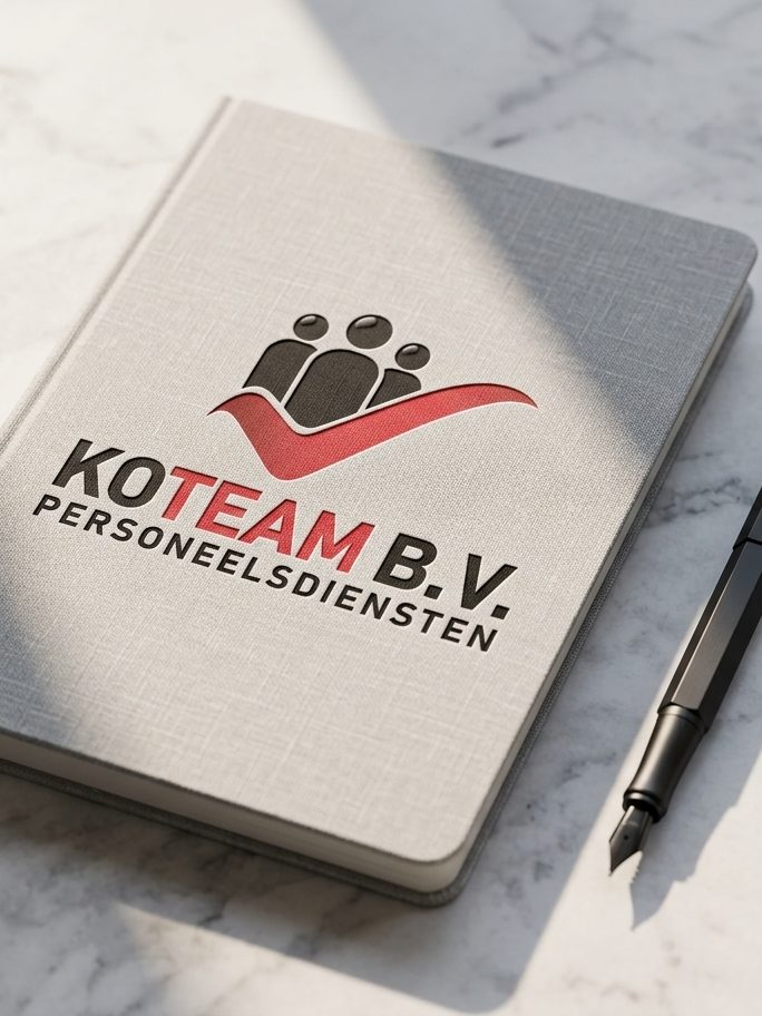
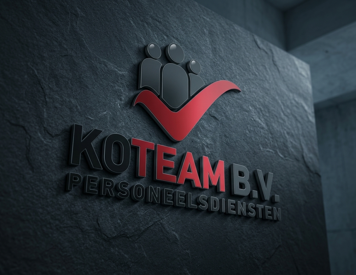
We developed the KOTEAM mark featuring three stylized human silhouettes representing teamwork and a strong workforce. A dynamic red checkmark swoosh symbolizes approved staffing solutions.
Typographic Integration
The design features a bold sans-serif wordmark with “KO” in black, “TEAM” in vibrant red, and “B.V.” in black. The uppercase “PERSONEELSDIENSTEN” descriptor creates a clear corporate hierarchy and communicates the service instantly.
Brand Identity
Visual elements, human-centered iconography, and a high-contrast color palette (vivid red and solid corporate black) were deeply integrated to reflect confidence and reliability. This tailored aesthetic helps the company build trust and strong brand recall across client contracts, job portals, and corporate touchpoints.
Application Focus
The visual layout is specifically optimized for HR documentation, corporate office signage, recruitment portals, and B2B presentation materials, perfectly aligning with the brand’s positioning for professional employment services.
Scalability & Legibility
A clean, high-contrast structural layout allows the logo to remain easily recognizable and highly legible across all scales — from small business cards, ID badges, and mobile app headers to large office entrance plaques and promotional banners.
Production Readiness
We developed this mark strictly for versatile brand reproduction. By utilizing sharp vector geometry, solid two-color separations (black and red), and clean form blocking, we ensured the design renders crisply whether applied to frosted glass panels, engraved office doors, corporate stationery, or digital platforms.
The Result
The final KOTEAM B.V. Personeelsdiensten design transforms a standard recruitment mark into a high-impact corporate identity tool, combining team symbolism with a bold approval checkmark and structured typography. This delivers a specialized branding solution that makes professional recognition effortless while ensuring the logo performs flawlessly across any physical or digital medium.
Let’s Build Your Brand Identity
Need a distinctive brand identity that makes your business stand out? We create thoughtful, cohesive brands — from logos and visual identities to color palettes, typography, packaging, and brand guidelines. We combine strategy and design to build a strong visual language that feels authentic, memorable, and ready to grow with your business.