SALT & PEPPER is a custom-designed brand identity created to elevate visibility and establish a memorable visual presence in the competitive fast-food and casual dining sector. Tailored for versatile application, the emblem is engineered to communicate artisanal flavor, warmth, and premium quality directly to consumers and B2B partners.
For the project, we developed a vintage-inspired emblem that highlights handcrafted culinary comfort, helping diners and delivery patrons instantly recognize the brand across menus, packaging, and storefronts.
What We Did
The brand mark was designed to be a bold, recognizable asset in the hospitality and quick-service space, replacing generic fast-food logos with a distinct, vintage-inspired, and brand-aligned visual identity.
Logo Concept
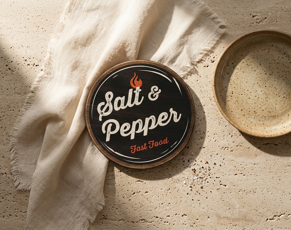
We developed the Salt & Pepper emblem with a dark wood-textured circular badge framed by clean concentric rings. The rich, rustic backdrop evokes classic diner aesthetics.
Typographic Integration
The design features expressive, distressed script typography for the primary naming, rendered in a warm off-white tone with realistic texture overlays. This is complemented by a vibrant red cursive script for “Fast Food”.
Brand Identity
Visual elements, rustic textures, and a warm color palette (deep wood charcoal, cream, and vivid red) were deeply integrated to reflect a high-quality culinary experience. This tailored aesthetic helps the brand build trust and strong recall across physical dining locations and delivery platforms.
Application Focus
The visual layout is specifically optimized for quick-service restaurants, food truck branding, and takeaway packaging, aligning with the brand’s positioning for modern yet classic casual dining.
Scalability & Legibility
A self-contained circular seal structure allows the logo to remain easily recognizable and highly legible across all sizes — from digital delivery app icons and coaster prints to large-scale exterior roundel signage and staff aprons.
Production Readiness
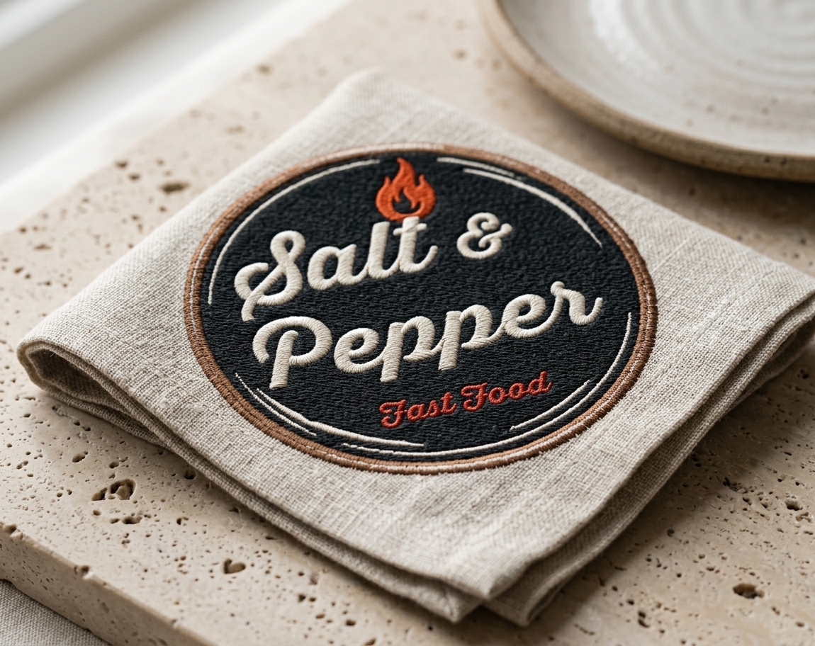
We developed this mark strictly for versatile brand reproduction. By utilizing clean vector framing, adaptable color separations, and textured fill overlays, we ensured the design remains crisp and vibrant when applied to kraft paper bags, corrugated boxes, wood-stamped boards, or uniform embroidery.
The Result
The final Salt & Pepper design transforms a standard fast-food mark into a premium, vintage-inspired branding tool, combining rich natural textures with expressive typography. This delivers a specialized identity solution that makes brand recognition effortless while ensuring the logo performs perfectly across any physical or digital medium.
Let’s Build Your Brand Identity
Need a distinctive brand identity that makes your business stand out? We create thoughtful, cohesive brands — from logos and visual identities to color palettes, typography, packaging, and brand guidelines. We combine strategy and design to build a strong visual language that feels authentic, memorable, and ready to grow with your business.