
10 Website Design Mistakes That Make You Lose Customers — Check Your Website!

A website is often the first point of contact between your business and a potential customer. If visitors struggle to find information, feel overwhelmed by the layout, or cannot figure out what to do next, they may leave before discovering what you offer.
We’ve collected 10 common website design mistakes that can cost your business leads, sales, and trust — and how to fix them.

1. A Confusing User Interface
If visitors have to guess where to click, your website is making things harder than they should be.
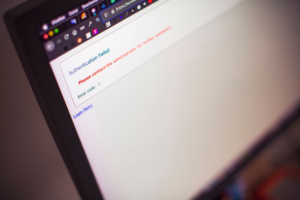
Unclear navigation, confusing menus, hidden buttons, and complicated page structures create unnecessary friction. Users should not need instructions to understand how your website works.
How to fix it: Keep navigation simple, use familiar interface patterns, organize content logically, and make important actions easy to find.
2. A Chaotic Layout
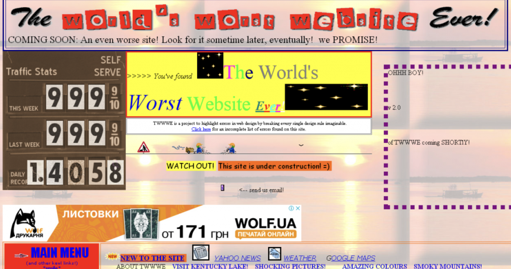
Too many elements competing for attention can make even a beautiful website difficult to use.
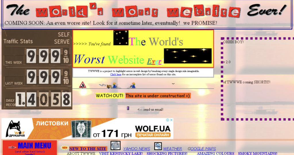
When images, text, buttons, banners, and decorative elements are scattered without a clear structure, visitors struggle to understand what matters most. Instead of guiding users, the design overwhelms them.
How to fix it: Create a clear visual hierarchy. Use consistent spacing, align elements properly, group related information, and give important content enough breathing room.

3. Unreadable Fonts and Poor Typography
Tiny text, decorative fonts, inconsistent font sizes, and long paragraphs can make your website exhausting to read.
If visitors have to zoom in or concentrate too hard to understand your message, they may simply give up.
How to fix it: Choose readable fonts, maintain consistent typography styles, use comfortable font sizes, and ensure sufficient line spacing. Break long sections into shorter paragraphs with descriptive headings.

4. The Wrong Color Palette
Low contrast between text and background can make important information almost impossible to read. Too many bright colors can create visual noise, while inconsistent colors can make the website feel unprofessional.
How to fix it: Develop a consistent color palette that reflects your brand. Use contrast to highlight important actions, keep backgrounds comfortable to read, and check text contrast for accessibility.

5. No Clear Call to Action
Without obvious calls to action, visitors may leave without taking the next step. A website should not just present information; it should guide people toward a meaningful action.
How to fix it: Use clear, specific buttons such as “Get a Quote,” “Book a Consultation,” or “Explore Our Services.” Place them where users naturally need them, and make sure they stand out from surrounding content.

6. A Website That Works Poorly on Mobile
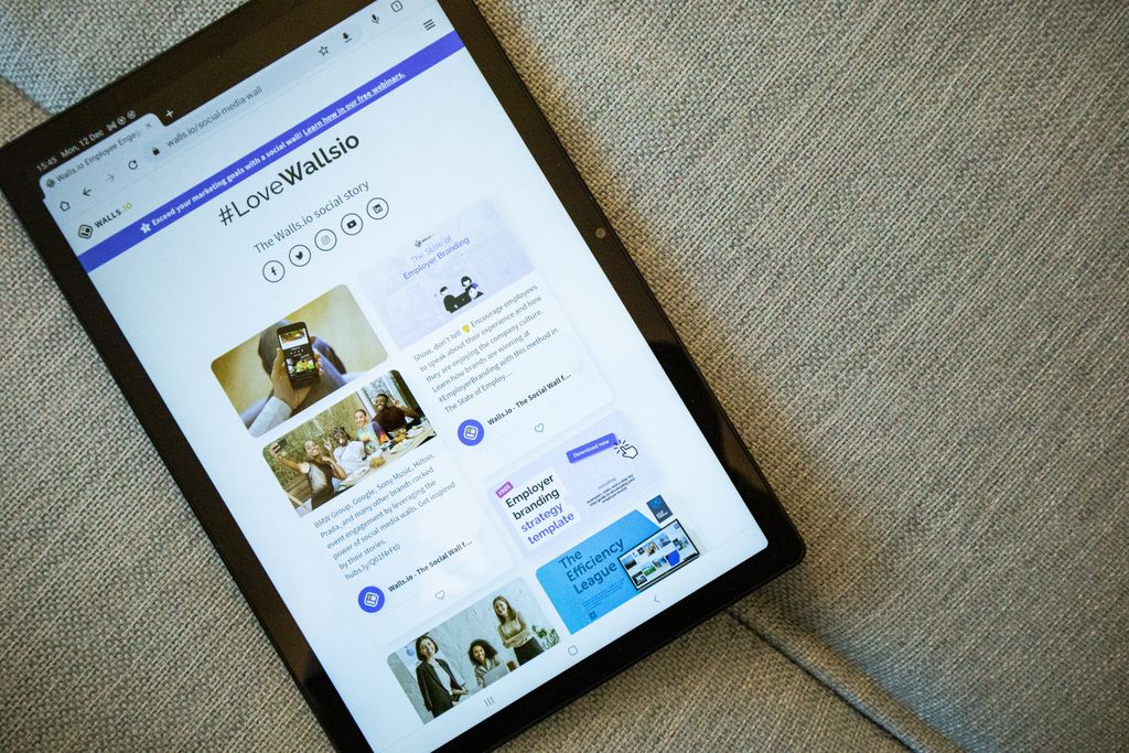
A website that looks great on a desktop but breaks on a smartphone can cost your business valuable opportunities.
Text that is too small, buttons that are difficult to tap, horizontal scrolling, and poorly arranged images all create a frustrating mobile experience.
How to fix it: Design responsively from the beginning. Test your website on different screen sizes, make buttons touch-friendly, optimize images, and ensure that navigation works smoothly on mobile devices.
7. Too Much Information on One Page
More content does not automatically mean more value. When every service, benefit, feature, and company detail competes for attention, visitors can lose sight of the main message. A crowded homepage may leave people wondering what your business actually does.
How to fix it: Prioritize information based on your visitors’ needs. Lead with a clear value proposition, highlight your main services, and organize additional details into dedicated sections or pages.

8. Slow Loading Speed and Heavy Visuals
High-quality visuals can make a website memorable, but oversized images, unnecessary animations, and poorly optimized files can slow it down.
When pages take too long to load, visitors may leave before seeing your content. Performance also affects usability, particularly for people browsing on mobile devices or slower connections.
How to fix it: Compress images, use modern image formats, reduce unnecessary scripts and animations, and review your website’s performance regularly.
9. Inconsistent Branding and Visual Style
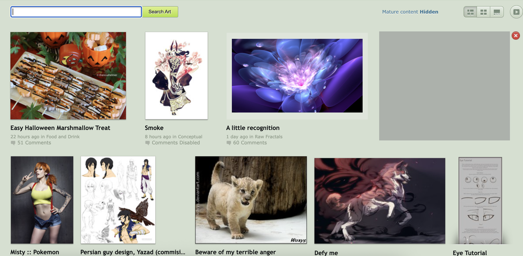
Inconsistency makes a website feel disorganized and can weaken brand recognition. Visitors may question whether the business is professional, established, or trustworthy.
How to fix it: Establish a consistent design system that includes colors, typography, buttons, icons, spacing, and image styles. Apply these rules across every page.
10. Forgetting About Trust and Credibility
Missing contact information, vague service descriptions, outdated content, low-quality images, and a lack of real project examples can create doubt. Potential customers need to understand who you are, what you do, and why they should choose you.
How to fix it: Show real work, explain your services clearly, provide accurate contact details, and include relevant testimonials, case studies, or client results when available. Keep your content current and make it easy for visitors to reach you.

How to Know If Your Website Is Losing Customers
You do not have to guess whether your website needs improvement. Start by reviewing how people interact with it.
Ask yourself:
- Can a first-time visitor understand what my business offers within a few seconds?
- Is the main navigation easy to use?
- Can visitors find important information without unnecessary clicks?
- Is the text readable on both desktop and mobile?
- Are the primary calls to action visible and clear?
- Does every page feel consistent with my brand?
- Does the website load quickly and work properly on different devices?
You can also use website analytics, session recordings, usability tests, and user feedback to identify where visitors encounter difficulties.

Before You Go
Your website is more than a digital business card. It is part of your brand experience, your communication strategy, and your customer journey.
A confusing interface, chaotic layout, unreadable typography, or inconsistent visual style may seem like small design problems.
At Vago, we believe that great design should work as beautifully as it looks. If your website is not communicating your value or guiding visitors toward action, it may be time to rethink the experience.

Need a website that looks professional and works for your business? Let’s create a digital experience your customers will love.
Get in touch with us to discuss your next project.
Leave a Reply